The Color That Made My Portfolio Feel Wrong
4 min · Jul 2026
I changed one color and the entire portfolio stopped making sense.
The layout was still clean. The typography still worked. Nothing was technically broken. But the page felt muddy, as if every element belonged to the same visual layer.
The problem was not the layout.
It was the relationship between three colors.
A redesign nobody could see
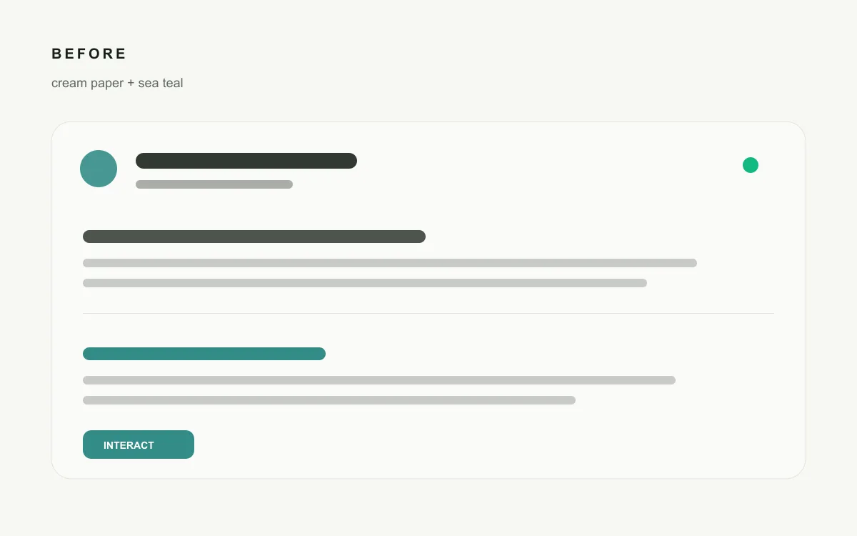
My original background was close to cream. During the redesign, I replaced it with #f7f8f3, expecting the page to feel fresher and more natural.
Technically, it was a new color.
Visually, almost nothing had changed.
The difference was only a few RGB values. On my screen, the new background still looked like the old off-white. I had changed the token without changing the identity.
That led to a more uncomfortable question:
If a design decision cannot be noticed, is it really doing anything?
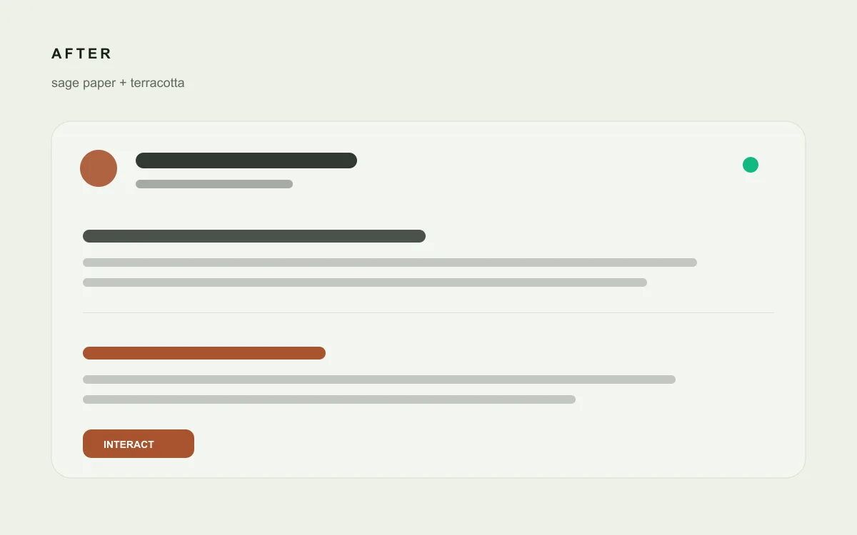
I pushed the background further to #ecf1e6. This time, the green cast was unmistakable. It looked less like a default website canvas and more like sage-colored paper.
The page finally had an atmosphere.
But fixing the background exposed another problem.
The accent that stopped working
At the time, I was using teal as the accent color.
Teal looked reasonable beside cream. Beside a genuinely green background, it became awkward.
The colors were different, but not different enough. The background had a hue near 87 degrees, while teal sat near 173 degrees. They were separated by roughly 86 degrees: too far apart to feel harmonious, but too close to create useful contrast.
Instead of reinforcing each other, they produced a muddy middle.
This was the turning point. I could either pull the background back toward white or replace the accent.
Returning to white would have solved the immediate problem, but it would also remove the identity I had just found.
So I kept the sage paper and rejected the teal.
The color on the other side
I replaced teal with terracotta.
The choice was not just aesthetic. Terracotta sits near the opposite side of the color relationship. Its warm, earthy tone separates clearly from the green paper without feeling synthetic.
The final light-mode accent became #a8532f.
It also passed the practical test: enough contrast for links, hover states, and focus indicators.
:root {
  --background: #ecf1e6;
  --brand: #a8532f;
  --live: #10b981;
}
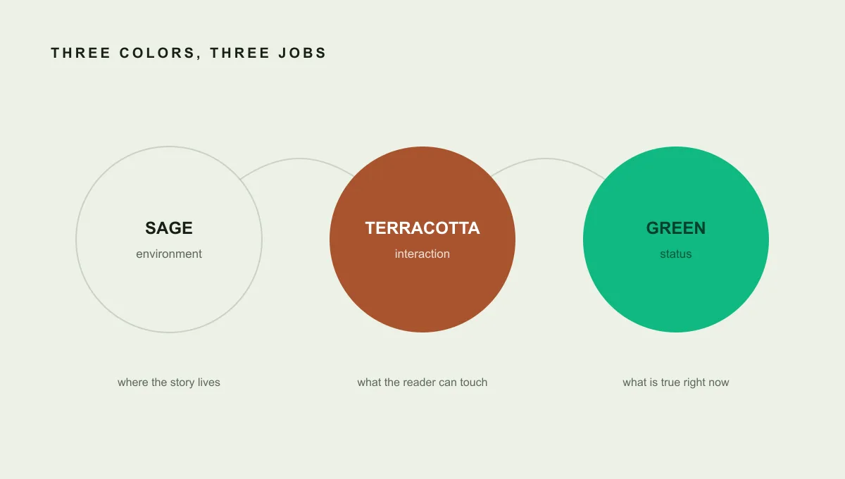
For the first time, the palette had a clear structure:
- Sage was the environment.
- Terracotta meant interaction.
- Green meant availability.
Two colors, two jobs
The portfolio already had a green availability dot.
Once terracotta became the main accent, I considered recoloring the dot so everything would match. That would have produced a more unified palette, but a less understandable interface.
A green status dot already has meaning. Products such as Slack and Discord have trained us to read green as available. Turning it terracotta could make it feel like a warning or an away state.
So I stopped trying to make one color do every job.
Terracotta now answers:
Can I interact with this?
Green answers:
What is the current status?
That separation also gave me a simple rule for future changes. I do not add the brand color to text just because the page needs more color. If an element is not interactive, terracotta usually does not belong there.
The constraint prevents the accent from becoming decoration.
What the palette taught me
The redesign was not fixed by finding a prettier hex value.
It was fixed by deciding what each color was responsible for.
That changed how I evaluate visual systems. I no longer look at colors individually and ask whether each one looks good. I look at the relationships between them:
- Is the background visibly different from a default canvas?
- Does the accent separate from the background?
- Does every color have a specific job?
- Would removing a color make the interface less understandable?
A palette becomes useful when it explains the product without needing documentation.
The strange part is that the final design looks simpler than the version that failed.
But simplicity was not where I started.
It was what remained after every color had a reason to exist.